You hit it right there.
We all have opinions, and some will and some won't align with yours. We all have ideas of how to spend your money to suit our personal style but when it's the opinion that matters most. It comes down to who's swiping their card.
With that said

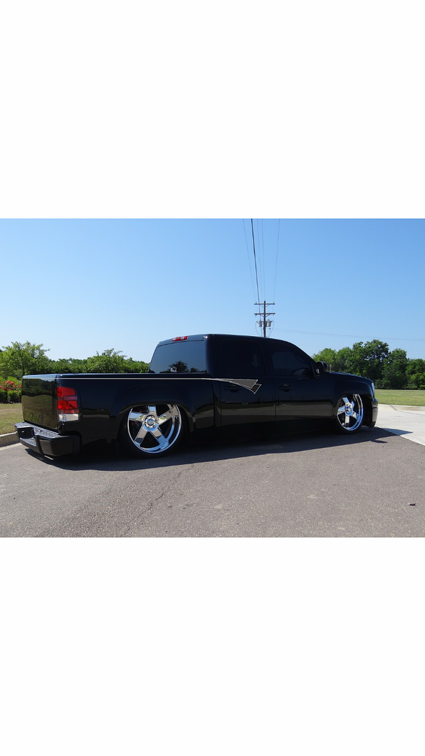
I too see red being a great accent, and I also have always envisioned the stripes coming from the front. But, that quick render looks really good and if you could d a way to tie a stripe on the gate in with that detail that could be money. And maybe the red comes in as a pinstriped accent in that painted detail or maybe it's a candy clear coat over the silver leaf which could look really cool
Edit: also the detail shape would have to change. That looks too much like the patriots logo


